


IoT Data Visualization: Internet Of Things Explained

Key Insights
- Visualizing IoT data makes it easier to understand and uncover important patterns, trends, and insights from data collected by IoT devices
- IoT data types include device data, log data, and sensor data
- Managing and analyzing IoT’s diverse data requires advanced and efficient storage and processing solutions
- IoT data visualization is key in healthcare, manufacturing, and urban development
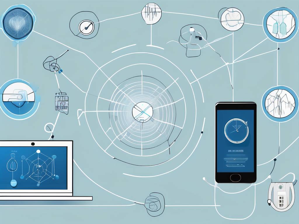
The Internet of Things (IoT) is a rapidly evolving technology that is transforming the way we interact with the world around us. The IoT is a network of physical devices, vehicles, buildings, and other items embedded with sensors, software, and network connectivity that enables these objects to collect and exchange data. This data, when properly analyzed and visualized, can provide valuable insights that can be used to improve efficiency, lower operational costs, monitor key performance indicators, and make data driven decisions.
Data visualization in IoT allows users and businesses to identify patterns, trends, and insights from the vast amount of data generated by IoT devices. Data visualization is a tool data scientists use to present data points in a pictorial or graphical format, making complex data more understandable, accessible, and usable. This article will delve into the intricacies of IoT data visualization, providing a comprehensive understanding of its various components, applications, and challenges.
Understanding IoT Data
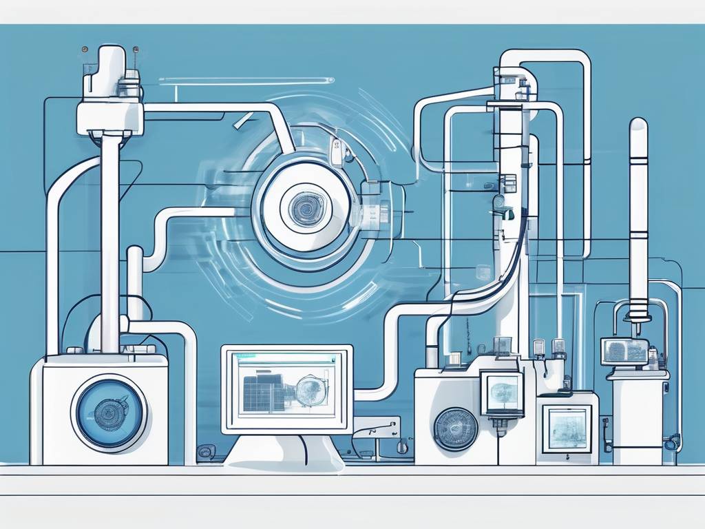
IoT data refers to the information collected by the various devices and sensors that are part of the IoT network. These devices can range from simple sensors that monitor temperature or humidity, to complex machines like autonomous vehicles or industrial robots. The data collected from these devices can be either structured or unstructured, and is gathered in various formats including numbers, text, images, audio, and video. The volume of data generated by IoT devices is staggering, and it is estimated that by 2025, 79.4 zettabytes of data will be generated by IoT devices.
Types of IoT Data
IoT data can be classified into three main categories: device data, log data, and sensor data. Device data is the information collected from devices connected to the Internet of Things network. This includes metadata regarding the device’s operational status, configuration settings, and sometimes the commands it receives or actions it performs. This data is transmitted to a centralized hub or cloud platform for storage, processing, and analysis. It serves as the foundation for understanding device behavior, monitoring performance, and generating insights to improve efficiency, productivity, and user experiences within the IoT ecosystem.
Log data includes the events, performance, errors, and access of IoT devices and the systems they interact with, such as when the device was turned on or off, or any errors or issues it encountered. This information provides crucial insights into the operational status and performance of the device. It serves as a valuable resource for troubleshooting, identifying patterns of usage, and ensuring the IoT network operates efficiently, securely, and reliably.
Sensor data serves as the digital representation of the environment surrounding the device, capturing intricate details through measurements like temperature, humidity, pressure, and motion. This data acts as the eyes and ears of the IoT network, providing invaluable insights into real-world conditions and device interactions. By interpreting sensor data, businesses can uncover nuanced patterns, detect anomalies, and derive actionable intelligence, empowering them to optimize processes, enhance user experiences, and drive innovation within the IoT landscape.
Visualizing IoT Data
By visualizing IoT data, users and businesses can see patterns, trends, and insights that would be difficult to discern from raw data alone. Data visualization can be particularly useful in IoT applications where the data is complex and multidimensional.
For example, in a city application, data from various sensors and devices can be visualized on a map to show traffic patterns, air quality levels, and other city-wide metrics. This can help city planners make informed decisions about urban development, traffic management, and environmental policies.
Data Visualization Techniques
There are many different types of data visualization, each with its own strengths and weaknesses. The choice of visualization type depends on the nature of the data and the insights that are sought. Some of the most common types include bar charts, line graphs, scatter plots, and heat maps. Learn more about these below:
- Bar Charts & Histograms: These can be used to compare data across different categories or to show distributions of data, such as the number of times a sensor value falls within certain ranges. This is useful for understanding the variability in IoT data, like the frequency of specific alarm types being triggered.
- Time Series Charts: Many IoT applications involve tracking changes over time, such as temperature trends in a building or speed variations of a vehicle. Line graphs or area charts are perfect for visualizing such time series data, showing how the data changes over a set period.
- Scatter Plots: When the goal is to explore the correlation between two distinct variables across IoT devices, scatter plots emerge as a highly informative visualization tool. Such plots are particularly adept at revealing patterns, such as those between temperature and humidity readings, as collected from an extensive network of environmental sensors.
- Heat Maps: Heat maps excel as a visualization tool for representing the intensity of specific variables across diverse locations. For instance, they can depict Wi-Fi signal strength throughout a corporate campus, offering insights into connectivity hotspots and areas needing improvement.
- Geographic Maps: For IoT applications that involve location data, such as fleet tracking or environmental monitoring across different regions, geographic maps are invaluable. They can plot the locations of various IoT devices and visualize data specific to those locations, providing spatial context that can be critical for decision-making.
- Real-Time Dashboards: For IoT systems, real-time dashboards are essential. They provide an at-a-glance view of the current state of the IoT ecosystem, including the status of devices, current readings from sensors, and any alerts or notifications. This kind of visualization helps in monitoring and managing IoT devices efficiently.
The complexity and diversity of IoT data requires versatile visualization tools that can handle real-time data streaming, large datasets, and the need for interactive, user-friendly interfaces. Advanced visualization platforms for IoT often incorporate machine learning and predictive analytics features, enabling not just historical data analysis but also future trend predictions. This integration enhances the decision-making process, allowing for more proactive management of IoT systems and devices.
Tools for Data Visualization
There are many tools available for data visualization, ranging from simple spreadsheet programs to sophisticated data visualization software. Some of the most popular IoT visualization tools include Tableau, Power BI, QlikView, and D3.js. These tools offer a wide range of visualization options and features, and can handle large volumes of data.
Choosing the right tool for data visualization depends on several factors, including the complexity of the data, the desired visualization type, the volume of data, and the user’s technical skills. Some tools, like Tableau and Power BI, are user-friendly and require little technical skill, making them suitable for business users. Other tools, like D3.js, require more technical skill but offer greater flexibility and customization options.
Applications of IoT Data Visualization
IoT data visualization is instrumental across various sectors, enabling insightful analysis and informed decision-making. Some of these sectors include manufacturing, transportation, urban development, and healthcare.
Manufacturing
In the manufacturing sector, IoT technologies gather data concerning machine functionality, product integrity, and operational efficiency. Visualization of this data aids in pinpointing inefficiencies or bottlenecks, refining production workflows, and enhancing product standards. Through such visual insights, manufacturers can swiftly identify areas requiring improvement to streamline operations and improve quality.
Transportation
The transportation sector harnesses IoT data for enhancing autonomous vehicles, managing fleets, and improving traffic and public transport systems. By visualizing this data, organizations can refine travel routes, schedule predictive maintenance, and increase fuel efficiency. For example, real-time traffic updates from sensor data help drivers avoid congested routes, reducing overall traffic and fostering safer transportation.
Urban Development
Smart city initiatives stand out as prime examples of IoT data visualization applications. In these cities, various IoT sensors and devices gather urban data, including air quality indexes and energy usage statistics. This information, presented through city-wide dashboards, provides urban planners and citizens with instant insights into urban conditions and operational metrics. Visual representations of air quality data can pinpoint pollution hotspots, guiding interventions for air quality enhancement. Similarly, visualizing energy consumption data reveals usage trends, aiding in the optimization of energy distribution and the promotion of conservation practices.
Healthcare
In the healthcare sector devices such as IoT wearable fitness trackers, remote patient monitoring systems, and intelligent medication dispensers compile extensive health-related data. Visualizing this information offers healthcare professionals a detailed overview of a patient’s health, aiding in condition monitoring, anomaly detection, and therapeutic decision-making.
For instance, visualizing data from wearable devices can illustrate a patient’s activity levels, sleep cycles, and heart rate trends, helping identify potential health issues signaled by changes in these metrics. Visualization of real-time vital signs from remote monitoring devices allows for the continuous observation of patient conditions, facilitating prompt responses to any significant health alterations.
Challenges in IoT Data Visualization
IoT data visualization faces a series of complex challenges due to the unique characteristics of data generated by interconnected devices. The most significant challenges are linked to the quality of collected data and the complexities of its storage.
Data Quality
The quality of data is crucial for ensuring the clarity and reliability of visualizations, as minor discrepancies or errors can lead to misleading interpretations. High-quality data ensures that visualizations accurately reflect real-world conditions, enabling decision-makers to draw precise conclusions and take informed actions.
The diversity of devices and sensors in IoT networks means that data can vary in accuracy, consistency, and format. This diversity requires advanced data quality management strategies, such as comprehensive data cleaning, validation, and transformation, to make IoT data suitable for visualization. Overlooking these data quality issues can result in misleading visualizations, potentially leading to incorrect insights and decisions.
Data Storage
The visualization of IoT data requires robust storage and processing capabilities. To translate this data into meaningful visual representations, organizations need scalable infrastructure and powerful processing capabilities. These requirements can substantially increase costs, making the visualization of IoT data a delicate balance between technological advancements and operational expenses.
Real-Time Processing & Visualization Tools
A significant challenge in IoT data visualization is the necessity for real-time or near-real-time processing and analysis across various applications. Traditional data management and analysis tools often struggle to meet this demand. The real-time nature of IoT data also requires the use of advanced algorithms and models to facilitate timely insights. Achieving this level of responsiveness frequently requires specialized visualization tools designed to process and display data promptly, ensuring that insights derived from IoT data are both timely and actionable.
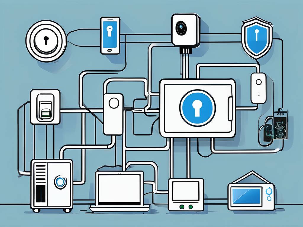
Security & Privacy
Ensuring the security and privacy of IoT data is a major concern in data visualization. IoT devices often collect sensitive data, such as personal health information or location data, which must be safeguarded against unauthorized access or disclosure. This requires robust security measures, such as data encryption, secure data transmission, and access control.
Privacy is also a crucial consideration, as some types of IoT data can reveal personal information about individuals. This requires careful data handling practices, such as anonymization or aggregation of data, to protect individuals’ privacy. Complying with data protection regulations, such as the General Data Protection Regulation (GDPR) in the European Union, is also a vital consideration in IoT data processing and visualization.
Conclusion
IoT data visualization is a critical aspect of the Internet of Things, providing valuable insights from the vast amount of data generated by IoT devices. IoT data analytics involves a complex process of data collection, data management, data analysis, and data presentation, and requires a combination of technical skills, analytical skills, and creative skills.
IoT visualization offers immense potential for improving efficiency, enabling innovation, and creating new business opportunities across various industries. As the Internet of Things continues to evolve and expand, the importance and value of IoT data visualization will only continue to grow.
Questions?
- What is IoT data visualization, and why is it essential in the Internet of Things (IoT)?Toggle questionIoT data visualization refers to the graphical representation of data generated by IoT devices. It is crucial for making sense of complex data sets, identifying patterns, and gaining actionable insights from the vast IoT ecosystem.
- How does data visualization enhance decision-making in IoT?Toggle questionVisualization simplifies complex data, enabling quicker comprehension. It empowers decision-makers to identify patterns, trends, anomalies, and correlations, leading to more informed and timely decisions in the realm of IoT.
- Which tools and technologies are commonly used for IoT data visualization?Toggle questionTo visualize IoT data, tools like Tableau and Power BI are favored for their powerful dashboard capabilities, while Grafana and Kibana are preferred for real-time monitoring and analysis of time series data. ThingSpeak offers a specialized platform for IoT analytics, enabling data aggregation and visualization in the cloud.
- How can businesses leverage IoT data visualization for better outcomes?Toggle questionBusinesses can leverage IoT data visualization to improve outcomes by turning vast amounts of data collected from connected devices into actionable insights. Visual tools help in identifying trends, patterns, and anomalies, enabling quicker decision-making. By monitoring real-time data, businesses can optimize operations, enhance customer experiences, improve safety, and reduce costs. Visualization aids in predictive maintenance, forecasting, and strategic planning, leading to more informed and effective business strategies.
- What is a IoT data visualization platform?Toggle questionAn IoT data visualization platform is a software solution designed to collect, integrate, analyze, and display data from IoT devices. These platforms enable users to see and understand complex data through graphical representations such as pie charts, graphs, and maps. By providing real-time insights and historical data analysis, they help in monitoring device performance, detecting anomalies, making informed decisions, and improving operational efficiencies. IoT data visualization platforms often include features for data aggregation, analytics, and alerting, making it easier for businesses and individuals to manage large networks of interconnected devices.


Comments